version:python 3.6
环境:anaconda/JupyterLab 0.27.0
操作系统:Windows 10
import pandas as pd
import matplotlib.pyplot as plt
a = pd.DataFrame(train_set['收率'].value_counts()).reset_index()
a.rename(columns={'index': 'yield','收率':'frequency'}, inplace=True)
a.head()
plt.figure(figsize=(24,8))
plt.bar(a['yield'].values,a['frequency'].values.round(2),color='rgb',width = 0.005,
tick_label=a['yield'].values.round(3))
plt.xlabel('yield', fontsize=20)
plt.ylabel('frequency', fontsize=20)
plt.show()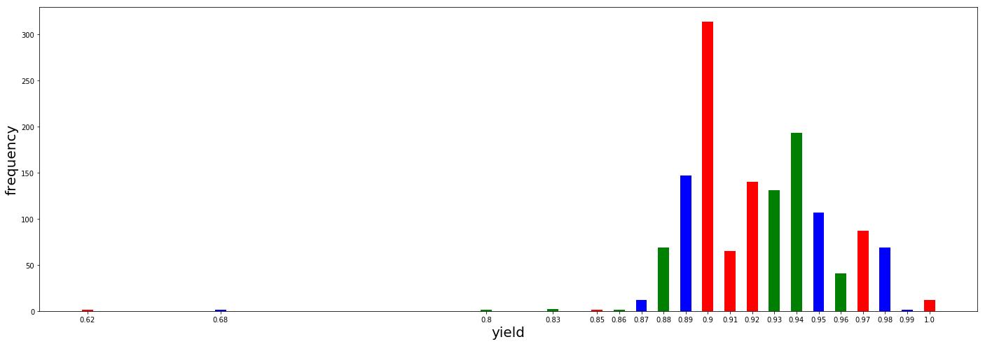
补充:python 用 matplotlib 绘制柱状图参数详解 plt.bar()
1、加载库
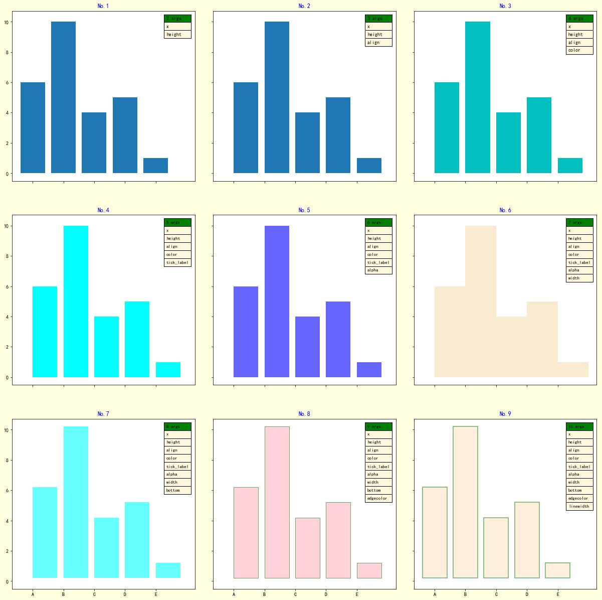
import numpy as np
import matplotlib as mpl
import matplotlib.pyplot as plt
2 绘图,逐步设置 bar() 参数
def title_table(ax):
    '''为图表添加标题和表格'''
    ax.set_title(label=f'No.{i+1}',
                loc='center',
                pad=None,
                fontdict={'color': 'b'}
                 )
    ax.table(loc='upper right',    # 表格在图表区的位置

          colLabels=[f'{i+2} args'],    # 表格每列的列名称
          colColours=['g'],    # 表格每列列名称所在单元格的填充颜色
          colLoc='left',    # 表格中每列列名称的对齐位置
          colWidths=[0.15],    # 表格每列的宽度
          cellText=args,    # 表格中的数值, 每行数据的列表的列表
          cellColours=[['cornsilk']]*len(args),    # 表格中数据所在单元格的填充颜色
          cellLoc='left',    # 表格中数据的对齐位置
          fontsize=8)
# 配置字体,显示中文
mpl.rcParams['font.sans-serif'] = ['SimHei']
# 配置坐标轴刻度值模式,显示负号
mpl.rcParams['axes.unicode_minus'] = True
# 定义数据
x = [1, 2, 3, 4, 5]
y = [6, 10, 4, 5, 1]
labels = list('ABCDE')

fig, axes = plt.subplots(nrows=3,
                         ncols=3,
                         sharex=True,
                         sharey=True,
                         figsize=(18, 20),
                         facecolor='cornsilk')
axes = axes.ravel()
i = 0
ax = axes[i]
# 绘制柱状图
ax.bar(x=x,    # 柱体在 x 轴上的坐标位置
        height=y,    # 柱体的高度
       )
args = [[e] for e in ['x', 'height']]
# 向图表子区添加标题和数据表
title_table(ax)
i = 1
ax = axes[i]
# 绘制柱状图
ax.bar(x=x,    # 柱体在 x 轴上的坐标位置
        height=y,    # 柱体的高度
        align='edge',    #  x 轴上的坐标与柱体对其的位置
       )
args = [[e] for e in ['x', 'height', 'align']]
# 向图表子区添加标题和数据表
title_table(ax)
i = 2
ax = axes[i]
# 绘制柱状图
ax.bar(x=x,    # 柱体在 x 轴上的坐标位置
        height=y,    # 柱体的高度
        align='edge',    #  x 轴上的坐标与柱体对其的位置
        color='c',    # 柱体的填充颜色
        )
args = [[e] for e in ['x', 'height', 'align', 'color']]
# 向图表子区添加标题和数据表
title_table(ax)
i = 3
ax = axes[i]
# 绘制柱状图
ax.bar(x=x,    # 柱体在 x 轴上的坐标位置
        height=y,    # 柱体的高度
        align='edge',    #  x 轴上的坐标与柱体对齐的位置
        color='cyan',    # 柱体的填充颜色
        tick_label=labels,    # 每个柱体的标签名称
        )
args = [[e] for e in ['x', 'height', 'align', 'color', 'tick_label']]
# 向图表子区添加标题和数据表
title_table(ax)
i = 4
ax = axes[i]
# 绘制柱状图
ax.bar(x=x,    # 柱体在 x 轴上的坐标位置
        height=y,    # 柱体的高度
        align='edge',    #  x 轴上的坐标与柱体对其的位置
        color='blue',    # 柱体的填充颜色
        tick_label=labels,    # 每个柱体的标签名称
        alpha=0.6    # 柱体填充颜色的透明度
        )
args = [[e] for e in ['x', 'height', 'align', 'color', 'tick_label', 'alpha']]
# 向图表子区添加标题和数据表
title_table(ax)
i = 5
ax = axes[i]
# 绘制柱状图
ax.bar(x=x,    # 柱体在 x 轴上的坐标位置
        height=y,    # 柱体的高度
        align='edge',    #  x 轴上的坐标与柱体对其的位置
        color='wheat',    # 柱体的填充颜色
        tick_label=labels,    # 每个柱体的标签名称
        alpha=0.6,    # 柱体填充颜色的透明度
        width=1,  # 柱体的宽度
        )
args = [[e] for e in ['x', 'height', 'align', 'color', 'tick_label', 'alpha', 'width']]
# 向图表子区添加标题和数据表
title_table(ax)
i = 6
ax = axes[i]
# 绘制柱状图
ax.bar(x=x,    # 柱体在 x 轴上的坐标位置
        height=y,    # 柱体的高度
        align='edge',    #  x 轴上的坐标与柱体对其的位置
        color='aqua',    # 柱体的填充颜色
        tick_label=labels,    # 每个柱体的标签名称
        alpha=0.6,    # 柱体填充颜色的透明度
        width=0.8,    # 柱体的宽度
        bottom=0.2,     # 柱体基线的 y 轴坐标
        )
args = [[e] for e in ['x', 'height', 'align', 'color', 'tick_label', 'alpha', 'width',
                      'bottom']]
# 向图表子区添加标题和数据表
title_table(ax)
i = 7
ax = axes[i]
# 绘制柱状图
ax.bar(x=x,    # 柱体在 x 轴上的坐标位置
        height=y,    # 柱体的高度
        align='edge',    #  x 轴上的坐标与柱体对其的位置
        color='lightpink',    # 柱体的填充颜色
        tick_label=labels,    # 每个柱体的标签名称
        alpha=0.6,    # 柱体填充颜色的透明度
        width=0.8,    # 柱体的宽度
        bottom=0.2,    # 柱体基线的 y 轴坐标
        edgecolor='g'   # 柱体的边框颜色
        )
args = [[e] for e in ['x', 'height', 'align', 'color', 'tick_label', 'alpha', 'width',
                      'bottom', 'edgecolor']]
# 向图表子区添加标题和数据表
title_table(ax)
i = 8
ax = axes[i]
# 绘制柱状图
ax.bar(x=x,    # 柱体在 x 轴上的坐标位置
        height=y,    # 柱体的高度
        align='center',    #  x 轴上的坐标与柱体对其的位置
        color='bisque',    # 柱体的填充颜色
        tick_label=labels,    # 每个柱体的标签名称
        alpha=0.6,    # 柱体填充颜色的透明度
        width=0.8,    # 柱体的宽度
        bottom=0.2,    # 柱体基线的 y 轴坐标
        edgecolor='g',   # 柱体的边框颜色
        linewidth=1.5,   # 柱体边框线的宽度
        )
args = [[e] for e in ['x', 'height', 'align', 'color', 'tick_label', 'alpha', 'width',
                      'bottom', 'edgecolor', 'linewidth']]
# 向图表子区添加标题和数据表
title_table(ax)
# 设置整个子区的布局
fig.subplots_adjust(left=0,
                    bottom=0,
                    right=0.9,
                    top=1,
                    wspace=0.1,    # 子区间空白区域的宽度的归一化值
                    hspace=0.2);    # 子区间空白区域的高度的归一化值
图表
以上为个人经验,希望能给大家一个参考,也希望大家多多支持python博客。
- << 上一篇 下一篇 >>
python 如何设置柱状图参数
看: 1869次 时间:2021-06-21 分类 : python教程
- 相关文章
- 2021-12-20Python 实现图片色彩转换案例
- 2021-12-20python初学定义函数
- 2021-12-20图文详解Python如何导入自己编写的py文件
- 2021-12-20python二分法查找实例代码
- 2021-12-20Pyinstaller打包工具的使用以及避坑
- 2021-12-20Facebook开源一站式服务python时序利器Kats详解
- 2021-12-20pyCaret效率倍增开源低代码的python机器学习工具
- 2021-12-20python机器学习使数据更鲜活的可视化工具Pandas_Alive
- 2021-12-20python读写文件with open的介绍
- 2021-12-20Python生成任意波形并存为txt的实现
-
搜索
-
-
推荐资源
-
Powered By python教程网 鲁ICP备18013710号
python博客 - 小白学python最友好的网站!