以load_breast_cancer数据集为例,模型细节不重要,重点是画AUC的代码。
直接上代码:
from sklearn.datasets import load_breast_cancer
from sklearn import metrics
from sklearn.ensemble import RandomForestClassifier
from sklearn.model_selection import train_test_split
import pylab as plt
import warnings;warnings.filterwarnings('ignore')
dataset = load_breast_cancer()
data = dataset.data
target = dataset.target
X_train,X_test,y_train,y_test = train_test_split(data,target,test_size=0.2)
rf = RandomForestClassifier(n_estimators=5)
rf.fit(X_train,y_train)
pred = rf.predict_proba(X_test)[:,1]
#############画图部分
fpr, tpr, threshold = metrics.roc_curve(y_test, pred)
roc_auc = metrics.auc(fpr, tpr)
plt.figure(figsize=(6,6))
plt.title('Validation ROC')
plt.plot(fpr, tpr, 'b', label = 'Val AUC = %0.3f' % roc_auc)
plt.legend(loc = 'lower right')
plt.plot([0, 1], [0, 1],'r--')
plt.xlim([0, 1])
plt.ylim([0, 1])
plt.ylabel('True Positive Rate')
plt.xlabel('False Positive Rate')
plt.show()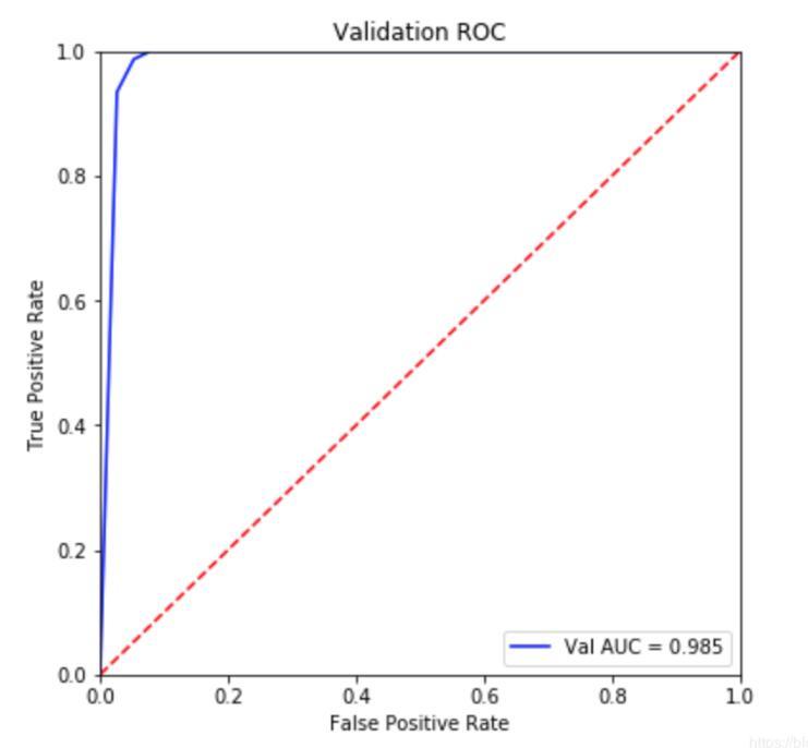
补充拓展:Python机器学习中的roc_auc曲线绘制
废话不多说,直接上代码
from sklearn.metrics import roc_curve,auc

from sklearn.ensemble import RandomForestClassifier

import matplotlib.pyplot as plt

from sklearn.model_selection import train_test_split

x_train,y_train,x_test,y_test=train_test_split(x,y,test_size=0.2)

rf=RandomForestClassifier()

rf.fit(x_train,y_train)

rf.score(x_train,y_train)

print('trainscore:'+str(rfbest.score(x_train,y_train)))
print('testscore:'+str(rfbest.score(x_test,y_test)))

y_score=rfbest.fit(x_train,y_train).predict_proba(x_test) #descision_function()不可用

print(type(y_score))

fpr,tpr,threshold=roc_curve(y_test,y_score[:, 1])
roc_auc=auc(fpr,tpr)
plt.figure(figsize=(10,10))
plt.plot(fpr, tpr, color='darkorange',
lw=2, label='ROC curve (area = %0.2f)' % roc_auc) ###假正率为横坐标,真正率为纵坐标做曲线
plt.plot([0, 1], [0, 1], color='navy', lw=2, linestyle='--')
plt.xlim([0.0, 1.0])
plt.ylim([0.0, 1.05])
plt.xlabel('False Positive Rate')
plt.ylabel('True Positive Rate')
plt.title('Receiver operating characteristic example')
plt.legend(loc="lower right")
plt.show()
以上这篇利用python画出AUC曲线的实例就是小编分享给大家的全部内容了,希望能给大家一个参考,也希望大家多多支持python博客。
-
<< 上一篇 下一篇 >>
标签:matplotlib
利用python画出AUC曲线的实例
看: 1723次 时间:2020-08-09 分类 : python教程
- 相关文章
- 2021-12-20Python 实现图片色彩转换案例
- 2021-12-20python初学定义函数
- 2021-12-20图文详解Python如何导入自己编写的py文件
- 2021-12-20python二分法查找实例代码
- 2021-12-20Pyinstaller打包工具的使用以及避坑
- 2021-12-20Facebook开源一站式服务python时序利器Kats详解
- 2021-12-20pyCaret效率倍增开源低代码的python机器学习工具
- 2021-12-20python机器学习使数据更鲜活的可视化工具Pandas_Alive
- 2021-12-20python读写文件with open的介绍
- 2021-12-20Python生成任意波形并存为txt的实现
-
搜索
-
-
推荐资源
-
Powered By python教程网 鲁ICP备18013710号
python博客 - 小白学python最友好的网站!